The Pantone Colour of the Year 2017
Greenery
Pantone is a company based in the United States and is known for their colour matching system. They have developed a standardized colour reproduction system. It is a system whereby manufacturers in different locations can all refer to Pantone to make sure colours match.
| The Pantone colour pick affects everything from floral fashion, runway fashion, and makeup, to paint colour, decorating, table tops, and the automobile industry. |
Twice a year Pantone hosts a secret meeting in a secret location and invites Colour Standards groups from around the globe. Together they discuss colour and make presentations and at the end of two days they decide on the colour for the following year.
Greenery
You are going to see this colour everywhere in 2017.
The statement issued by Pantone
"Greenery bursts forth in 2017 to provide us with the assurance we yearn for amid a tumultuous social and political environment. Satisfying our growing desire to rejuvenate and revitalize , Greenery symbolizes the re-connection we seek with nature, one another and a larger purpose."
The question is - Do you like this colour and how and where would you use it? How much of it should you use? What other colours go with it?
Green is practically a neutral. It goes with just about everything. I could see it with white, black, orange, beige, purple, yellow, pink blue. Gold or bronzed metals would be perfect with this colour.
You may not want to paint an entire room in Greenery, but, you could start with some accessories like pictures, throw pillows, dishes, green stems from the florist, bedding, and drapery either the entire drape or simply some trim.
You could use Greenery in any room - the powder room, bedroom, kitchen, living/dining rooms.
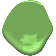
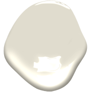
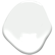
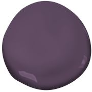
Below I have introduced paint chips from two other paint companies. They have similar colours to Greenery. As well, some ideas of colours to pair with them.
Sherwin Williams
 | ||
| Sherwin Williams Gossamer Veil SW9165 |
 |
| Sherwin Williams Merlot SW2704 |
 |
| Sherwin Williams Pure White SW7005 |
Benjamin Moore
 |
| Benjamin Moore Pleasant Grove 552 |
 |
| Benjamin MooreWind's Breath OC24 |
 |
| Benjamin Moore Wedding Veil 2125-70 |
 |
| Benjamin Moore Purple Lotus 2072-30 |
All paint companies pick their own Colour of the Year. In another post I will talk about some of the other picks for 2017.
Let me know what you think of Greenery. I would really like to know.
Barbara
<a data-pin-do="embedPin" href="https://www.pinterest.com/pin/99360735500167749/"></a>
<script async defer src="//assets.pinterest.com/js/pinit.js"></script>
<a data-pin-do="embedPin" href="https://www.pinterest.com/pin/99360735500167749/"></a>
<script async defer src="//assets.pinterest.com/js/pinit.js"></script>


Wow. I would like it in small doses as an accent color.
ReplyDeleteYes, it would be good to start using a little of this colour just to see if you like it and whether it is a fit with your present decor.
Delete